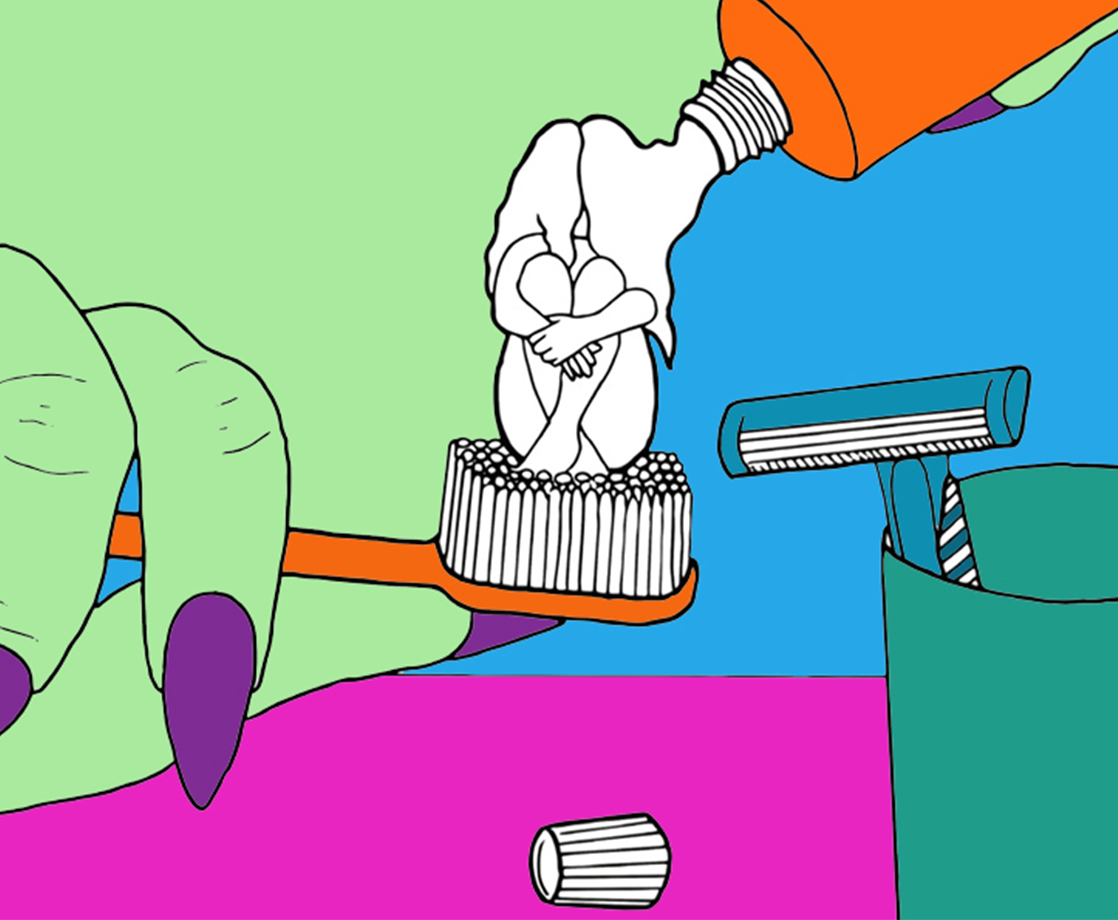
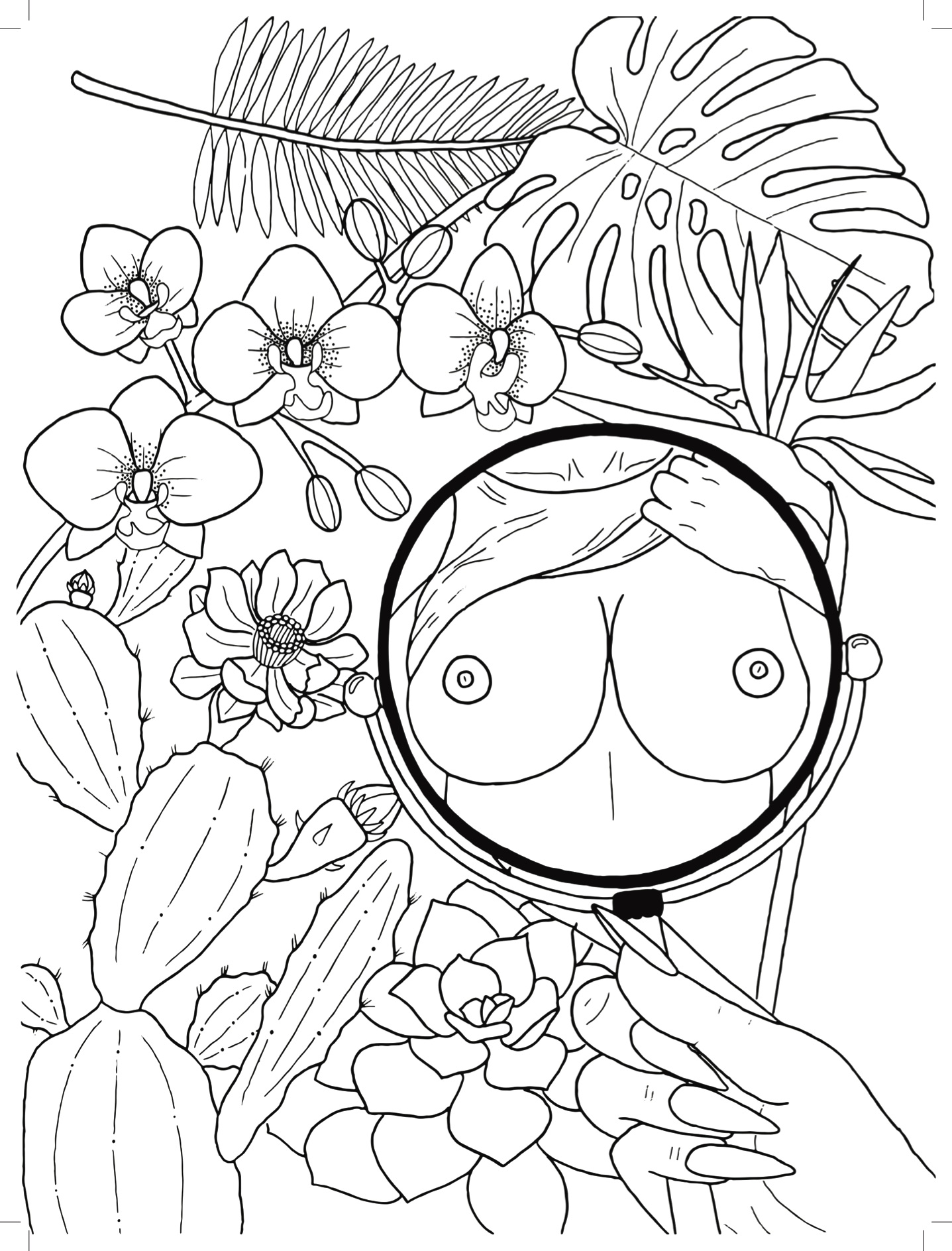
All images courtesy of Mira Gonzalez / Sorry House Press
Smoking dope and doodling are a symbiotic match like… well, smoking dope and doing pretty much anything creative. Mira Gonzalez — poet, writer, illustrator, and MERRY JANE’s very own social media editor — knows this, you know this, and anyone who’s ever seen Fantastic Planet or cracked open an R. Crumb book knows this.
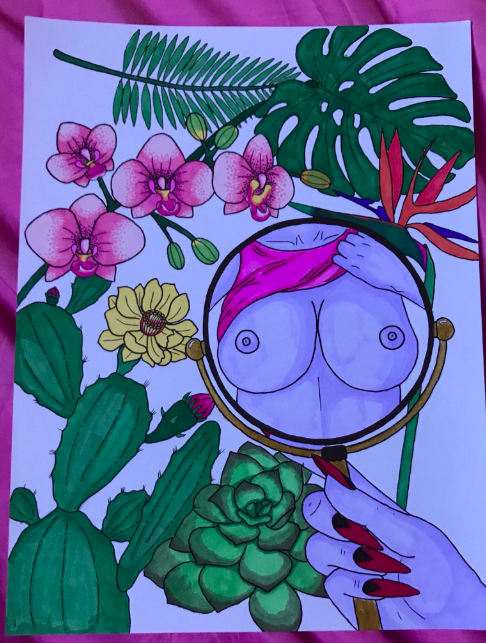
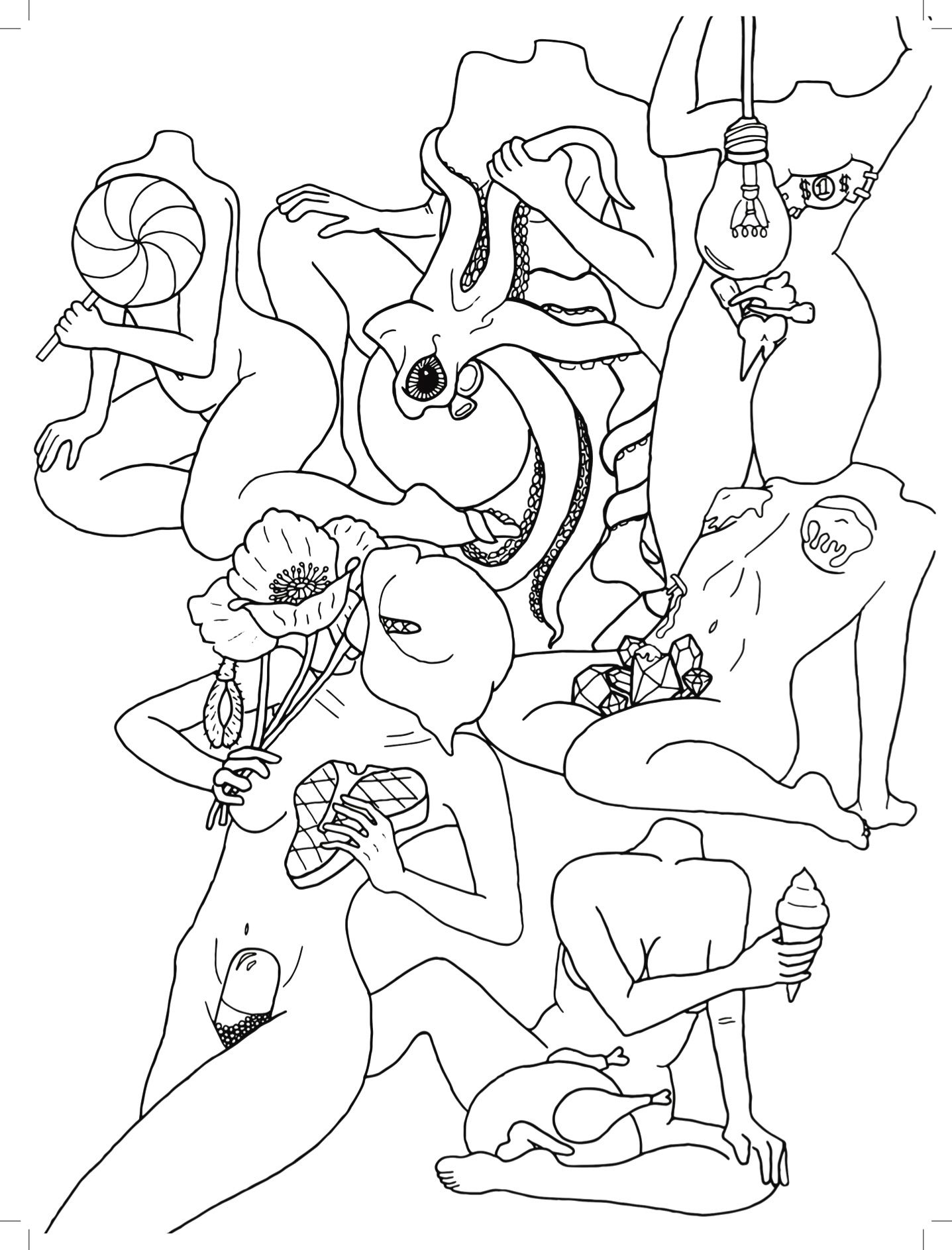
Gonzalez has done us all a favor then by combining indicas and illustration, sativas and scribbles, to create Homebodies, an adult coloring book that will make any marijuana lover’s mouth water. Released via Sorry House Press (who also published Gonzalez’s first book of poetry), the text features 18 original black-and-white illustrations that all but scream /r/woahdude. Whether it’s tableaux of headless nude women holding flowers, steak, and Adderall XR capsules — or a scene featuring a Bratz doll, a rooster, and a dude jerking off as mushrooms sprout from his neck — these tripped-out treats are begging to be colored in, and you, dear reader, can scratch that itch by buying a damn copy!
Sure, we’re biased here: Mira’s one of our favorite humanoids, and we’re probably embracing a little nugged-out nepotism. But let’s be honest: getting high and coloring surreal naked people is something all potheads can enjoy, making Homebodies an endo essential, as well as the best gift you can give a ganja fanatic besides weed itself. Below, MERRY JANE chatted with our colleague about how the book came to fruition, why she prefers illustrating in bed alongside her bong, and some insider knowledge about her secret (and superhuman) toe strength.
.jpg)
MERRY JANE: How would you describe this coloring book to someone who’s never seen your work before?
Mira Gonzalez: One time someone was talking to me about my illustrations, and they said “it’s basically just porn.” I think they meant it in a condescending way, but to me it actually seemed accurate. “Basically just porn” is how I describe my work now. My only concern is that I’m belittling porn stars by comparing my work to theirs. Their work seems a lot more labor intensive and thoughtful than mine. I basically just draw whatever comes to mind without any prior planning. Maybe a better description of my work would be “amateur porn.”
What time span does the art come from? Are these recent drawings, or does the work come from various parts of your illustration career?
It’s all from the last year or so. I think the oldest illustration was drawn at the beginning of 2017, but I re-traced most of them. I usually do some kind of shading in my drawings, but I wanted the drawings in this book to be blank so people could fill them in however they want.
Can you tell me about the production process of the book — specifically, I’m interested in how you figured out what illustrations are inviting for coloring purposes. In other words, what actually makes an illustration coloring book-friendly?
The main thing was just removing any shading or coloring, then choosing illustrations that actually looked good without color or shading. I think my definition of a “good coloring book” is different from a lot of other people’s definitions, though. Most adult coloring books have relatively complex designs to color in, because the act of coloring alone is supposed to be entertaining. Hence the ‘adult’ aspect. I don’t mean to say that my coloring book isn’t intended to be colored in, but the main goal is to encourage collaboration between me and the ‘colorer.’ I intentionally left a lot of blank space in most of the drawings, so that people can have room to actually draw on the picture and add elements to it, instead of just adding color. We also used really high quality paper so that people can do painting or collage without ruining the integrity of the drawing. The pages are also perforated, so people can take out their work and frame it if they’re especially proud of it. Or they can tear it out and burn it if they hate it. Whatever floats your boat.
I love the punny name Homebodies. Can you tell me what the title means to you, and how you decided on it?
I think “homebody” is a word I originally heard from my mom. As a kid, I would always call home from sleepovers in tears and ask my mom to pick me up. I didn’t like staying overnight at other people’s houses, or really anywhere besides my own house. It embarrassed me as a kid that I couldn’t just have fun at sleepovers like everyone else. When I expressed that feeling to my mom, she would always say “it’s okay, you’re just a homebody, like me,” and that made me feel a little better. As an adult, I’ve learned to embrace the homebody lifestyle. All my friends know that getting me to go to a party or social event is nearly impossible, and they’re OK with it for the most part. On one hand, I think the title is about my relatively new-found acceptance of being a person who likes to stay home. That is, I no longer think of staying home as a bad thing, or something I need to fix. On the other hand, I also literally did all the illustrations while at home in bed, and the illustrations are of bodies, so the title also works as a purely literal thing.
You’ve worked with Sorry House in the past. What was this collaboration like, compared to your past releases with the publishing house? Was there curation on the publisher’s side, or were you given free range to do you?
Well, when we published my first book [I Will Never Be Beautiful Enough to Make Us Beautiful Together] it was an absolute disaster lol. Not the book itself, the book turned out great and I’m still very proud of it, but saying that it ‘wasn’t your average publishing experience’ would be a massive understatement. Sorry House literally did not exist before that book, so in addition to writing and editing, Spencer [Madsen, founder of Sorry House] and I were also building a publishing house from the ground up. I remember some nights where we stayed up until sunrise manically googling shit like “is there a computer program for making books,” or “what does a publicist do?” It’s honestly a miracle that we didn’t die. By comparison, Homebodies was a much smoother experience. The only real learning curve was finding a printer that was OK with all the nudity. A couple printers refused the book, which was a pain, but Spencer was eventually able to find someone who did a really good job.
I like that while many of the bodies in the book are sexy, they’re also more “human” or realistic than your average drawing of a nude woman — we see stomach hair/happy trails on the subject next to the water cooler; stretch marks on the woman holding the swordfish, etc. Was this “no fronting” vibe intentional, or do you always depict people in raw, real-deal fashion?
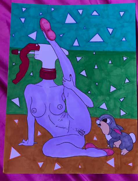
I wouldn’t say it’s intentional necessarily. Or, at least, I wasn’t trying to make any kind of statement by drawing the bodies that way. I honestly think I just got bored of seeing the same types of bodies over and over again. I wanted some variety. When I draw nudity, I don’t actually put that much thought into it. Naked bodies are just something that I find aesthetically pleasing, and I tend to prefer them in their natural state. I don’t want my art to be bound by any beauty standards besides my own.
Can you tell me how the image with the woman holding steak and an XR adderall between her legs came to fruition? That one is fucking bonkers!
I was actually just practicing sketching bodies in different positions at first, but then I ended up sort of liking it. The steak and pills and other props in the drawing were just things that I saw laying around my apartment while I was doodling, lol.
What’s the best environment for readers to actually sit down and spend some time doodling on the pages? If you were to craft the ideal “Interacting with ‘Homebodies’ Environment,” what would you recommend?
I generally avoid giving any instruction when it comes to my books, because I want people to have their own experiences with my work. I would hate for anybody to think that the way I interact with my own art is the ‘correct’ way. I don’t think there is a correct way. Like, personally, I would want to be in bed with all my art supplies and a freshly packed bong, but some other person’s ideal environment for interacting with homebodies could top of a sand dune. I hate sand, but if that’s someone else’s ideal environment, I want them to have that without thinking it’s ‘wrong.’
Do you have a personal favorite illustration to doodle over?
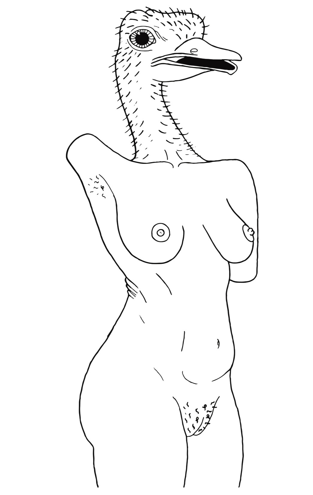
I like doodling on the girl with the ostrich head a lot. Also the cover image.
Do you have any other upcoming art projects or writing — outside of MJ — that fans like myself should keep an eye out for?
Stay tuned for an upcoming video where my friend Janice Griffith and I pick up heavy stuff with our toes to exhibit our freakish toe strength and flexibility. Release date TBD.
How does weed help you when it comes to illustration? Are there ever times where being high makes stuff harder with art?
Being high makes writing nearly impossible for me, but weed has always helped me make visual art. I love drawing while stoned. I don’t think it’s ever made visual art harder for me, now that I think about it. I wonder why that is…
What’s your favorite smoking method as of late? You mentioned the bong-in-bed routine earlier!
“Bong in bed” is an all-time classic for me. That’s one way of smoking that I will always return to. I do go through phases of mainly smoking joints or blunts, but it always end with me going back to the bong.
What type of imagery do you find the most challenging to draw?
I didn’t include any in this book, but drawing portraits is really hard for me. For some reason, I struggle with making a face I’m drawing look like a face in a photo. I’m always scared of offending people too, like maybe I’ll accidentally highlight their biggest insecurity or something. They take me forever to finish.
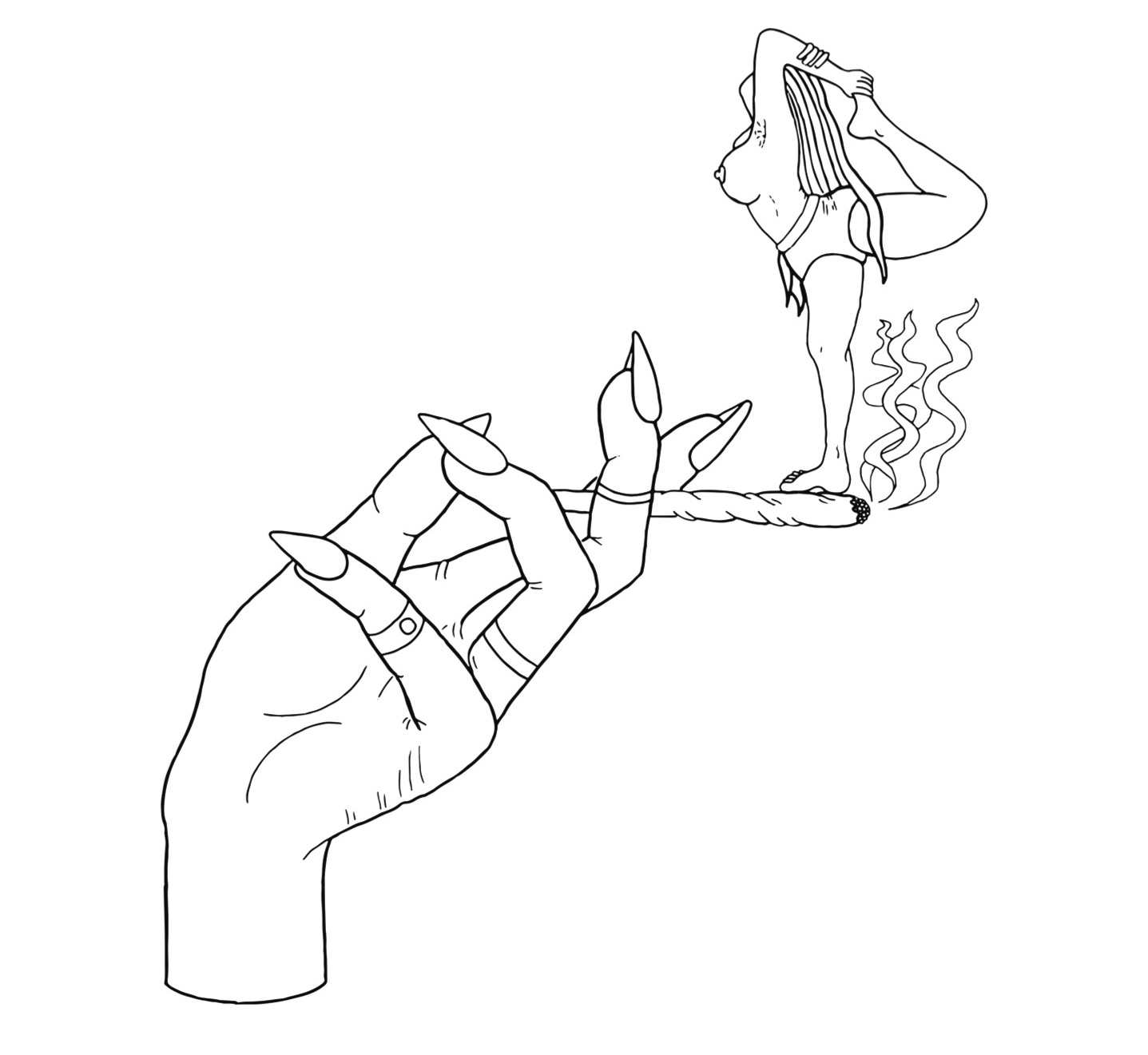
What’s your favorite type of 420 trope to draw? Joints? Nugs? Pot leaves?
I like drawing joints because I like drawing hands, and usually when I draw a joint, a hand is holding it.
If you could see a photo of any celebrity/public figure doodling on a copy of “Homebodies,” who would it be and why?
David Lynch, no question. I think David Lynch would do some really cool shit with the book that I probably never would have thought of myself. I would say John Waters, but I don’t think he does visual art (though I would still be thrilled if John Waters even knew I existed).
"Homebodies" is out now through Sorry House Press — order your copy here!
Follow Mira Gonzalez on Twitter