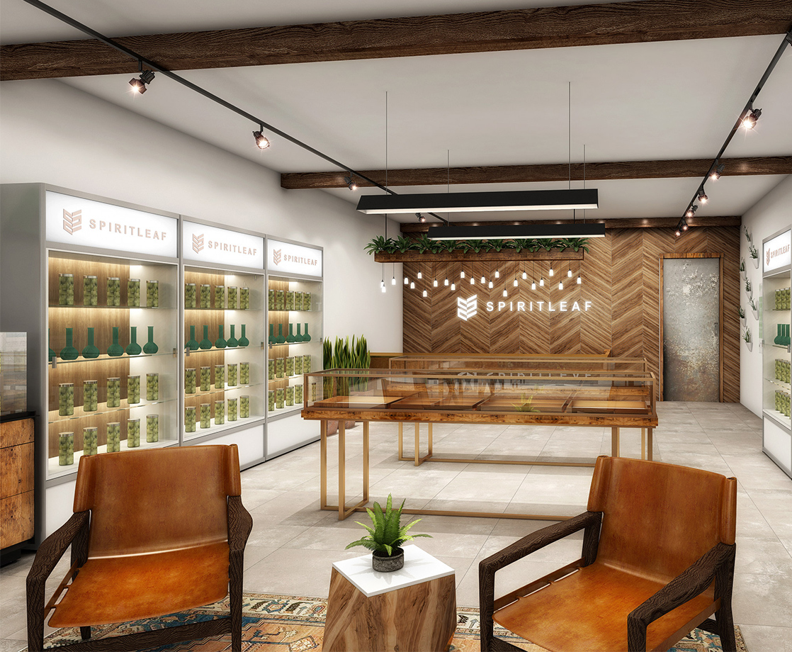
Lead image of Spirit Leaf Inc’s dispensary design concept art
Superette, one of three dispensaries to open in Ottawa, Canada, doesn’t really want to look like every other dispensary. You know the look: sleekish furnishings; angular, minimalist wall accents; an abundance of negative space everywhere. It’s a common design language.
Fire & Flower, a chain of dispensaries in Ontario and Western Canada, describes their shop aesthetic as “modern, bright… best-in-class store design that will aim to elevate the retail experience.” Another chain, Spiritleaf, says they wanted to create something with “positive energy” that embraces a “natural feeling” with “unique character.” MedMen wants to be the “Apple Store of weed.”
These descriptions mean both a lot and nothing at all: they’re an indication that the cannabis industry has shed its outlaw roots and adopted the ambitions and methods of contemporary interior design. But as functional words meant to distinguish one dispensary from another, they serve little value. Everyone wants to be modern. Everyone wants cutting-edge design. Everyone wants the best vibes for their dispensary.

Superette wants those things, too. But their store does look different — not just from other dispensaries, but from every other store. The whole place is modeled like an ahistorical anachronism: part ‘50s candy shop, part ‘80s diner, part streetwear pop-up. It’s aggressively Instagram-friendly by design.
“We looked at the other cannabis retail concepts out there — a lot of high-end, Apple-Store-of-cannabis [concepts]. We wanted something a little bit more fun,” Superette’s CEO Mimi Lam told MERRY JANE while milling around the dispensary about 20 minutes after it opened its doors on April 1.
Unlike other dispensaries, there are no screens to tap in orders. Beyond the cash terminals, there are no screens, period, unless you account for the large, standalone Pong machine in the back that customers can play while they wait. Everyone orders off of paper menus that riff on the classic diner menu style.
“We’re intentionally analog,” said Lam. “We want people to interact, not only with the product, but with the staff.”
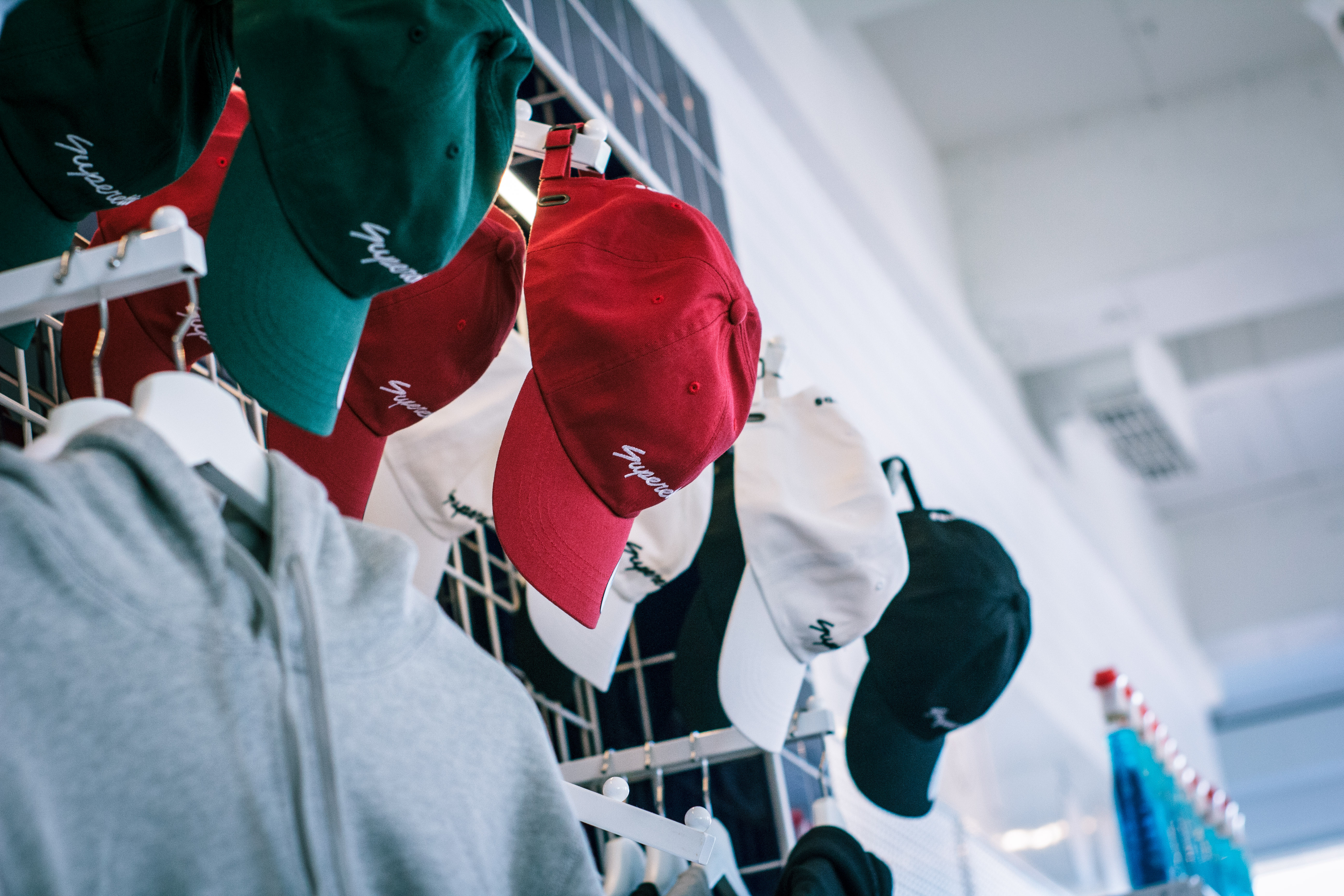
Above, Superette merchandise at the Ontario store
Rather than pristinely laid out, Superette’s packaged pre-rolls are tossed in candy jars or piled in baskets. Along the back wall, there’s a host of branded merch that, in an ironic regulatory twist, the store isn’t allowed to sell because it doesn’t count as cannabis paraphernalia, according one of the store’s employees. Once you order your weed, it takes a minute or two for the order to be retrieved from the back of the store. In the meantime, customers are encouraged to explore the premises.
Regardless if Superette’s approach to retail is novel — or at least more nuanced than its competitors — its very existence speaks to how the reefer retail experience has dramatically evolved in a short time. Thanks to legalization, there is now a growing design industry dedicated to remaking the image of cannabis dispensaries. For years, they have been janky, less-than-glamorous operations, often by legal necessity. Attempting to fly under the radar, many black-market dispensaries adopted the signature look of frosted windows, security doors, and nothing more than a green cross to identify itself as a dispensary. For a long time, those utilitarian design decisions worked just fine.
But in legal environments, these features are no longer sufficient or appealing, particularly to retailers who are after a new demographic of affluent, brand-conscious consumers looking as much for a retail experience as a retail outcome. As the dispensary market continues to expand, the interior design industry has increasingly become involved in creating that retail experience — which means that dispensaries become, almost accidentally, artifacts upon which the larger trends in retail design are projected.
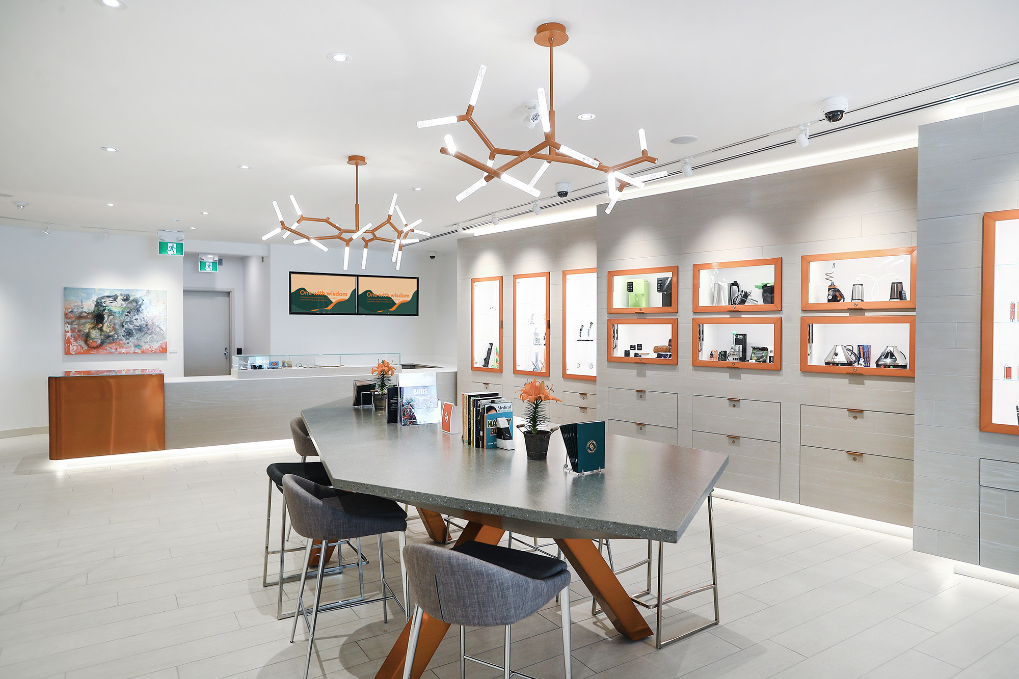
Above, Fire & Flower’s dispensary design concept art
There is an entire science behind the field of retail design, where erudite theories about small modifications, expressed in sentences like: “fast music such as pop is used during peak shopping hours to encourage high expenditure and impulse purchases while at the same time unconsciously promoting quick exits in order to accommodate more shoppers,” impact the way designers think about their work. When it comes to dispensaries, designers obsess over meticulous details to craft the perfect store. But really, the designers doing the work are chasing an intangible: to design a store that is as influential as — surprise — the Apple Store.
In dispensaries and cannabis spaces, this ambition presents itself in similar ways. It means clean, spartan fixtures and cabinets. Above all, the stores look impressively manicured. Far more in the store is concealed, hidden away in cabinets and back rooms, than laid out on the sales floor, in order to give the products an uncluttered presentation. Info about strains and products might also be put on tablet screens.
“At the time that Steve Jobs and the Apple team introduced the Apple Store, it was a pioneer,” explained designer Mardi Najafi, part of the team at figure3, a Toronto-based design firm that has worked on medical cannabis dispensaries in the United States. The thing that Apple and Steve Jobs did, he said, was bring the experience of the product — fiddling with it, holding it in your hands, seeing yourself possessing it — into the open.
“An Apple Store is honestly a marketplace, for cool gadgets,” he says. “It’s a bunch of harvest tables, just like a market. You walk around it, you touch and feel [the product].”
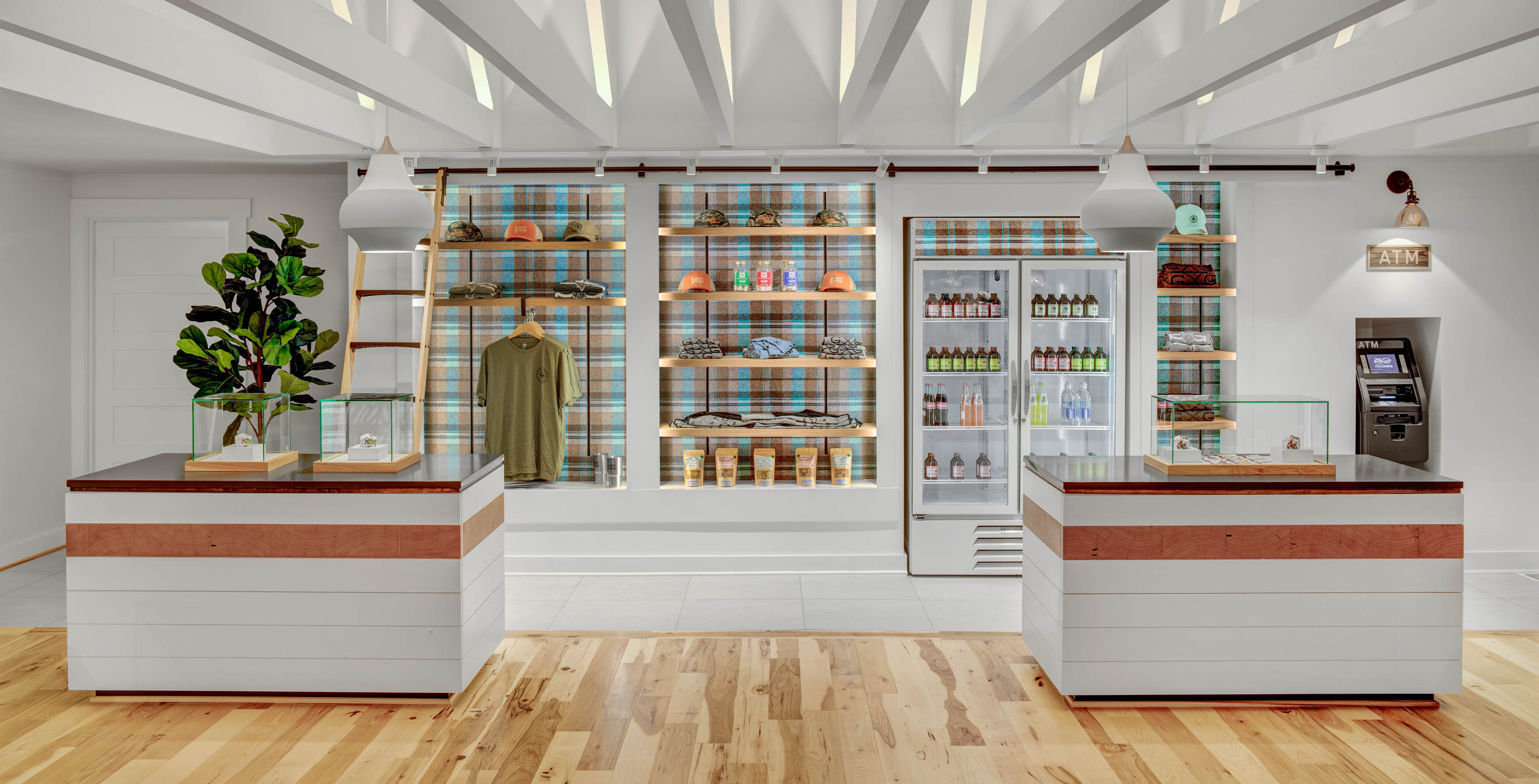
Above, Gnome Grown’s dispensary design concept art
The Apple Store quickly became a new, replicable model in the retail landscape, and everyone quickly followed at a time when brick-and-mortar stores were beginning to lose-out to online shopping. “Microsoft, you go into their store and it’s identical to an Apple Store. Samsung store? Identical. Sony store? Identical,” said Najafi. To say you’re the Apple-Store-of-something is less a physical comparison than an impressionist one. Being an Apple-Store isn’t about looking like something, it’s about offering the consumer an aesthetic experience around the art of consuming stimuli. And it works: Apple Stores still generate the highest revenues per square foot — more than twice the amount made by Tiffany’s.
There is no shortage of dispensaries claiming to be the “Apple Store of cannabis” — MedMen made it a key part of its branding — and Najafi is no different in claiming that title for one of figure3’s designs. One dispensary the company worked on, Surterra Wellness in Tampa, Fla., is modeled to be inviting, with a simple color palette, flat finished wood surfaces, and a faux kitchen that makes patients feel as if they are in someone’s home. The design is considered a success, and Najafi added that other businesses in the state of Florida are adapting parts of the design. Najafi also claimed that the designs for Surterra Wellness, which opened in 2017, were able to warm lawmakers and landlords in Florida to the idea of opening other medical marijuana shops.
“When the design is as smart as it was for Surterra, it changes people’s ideas of what it could be and should be, one hundred percent,” he said. “I strongly believe we did the Apple Store for medicinal marijuana.”
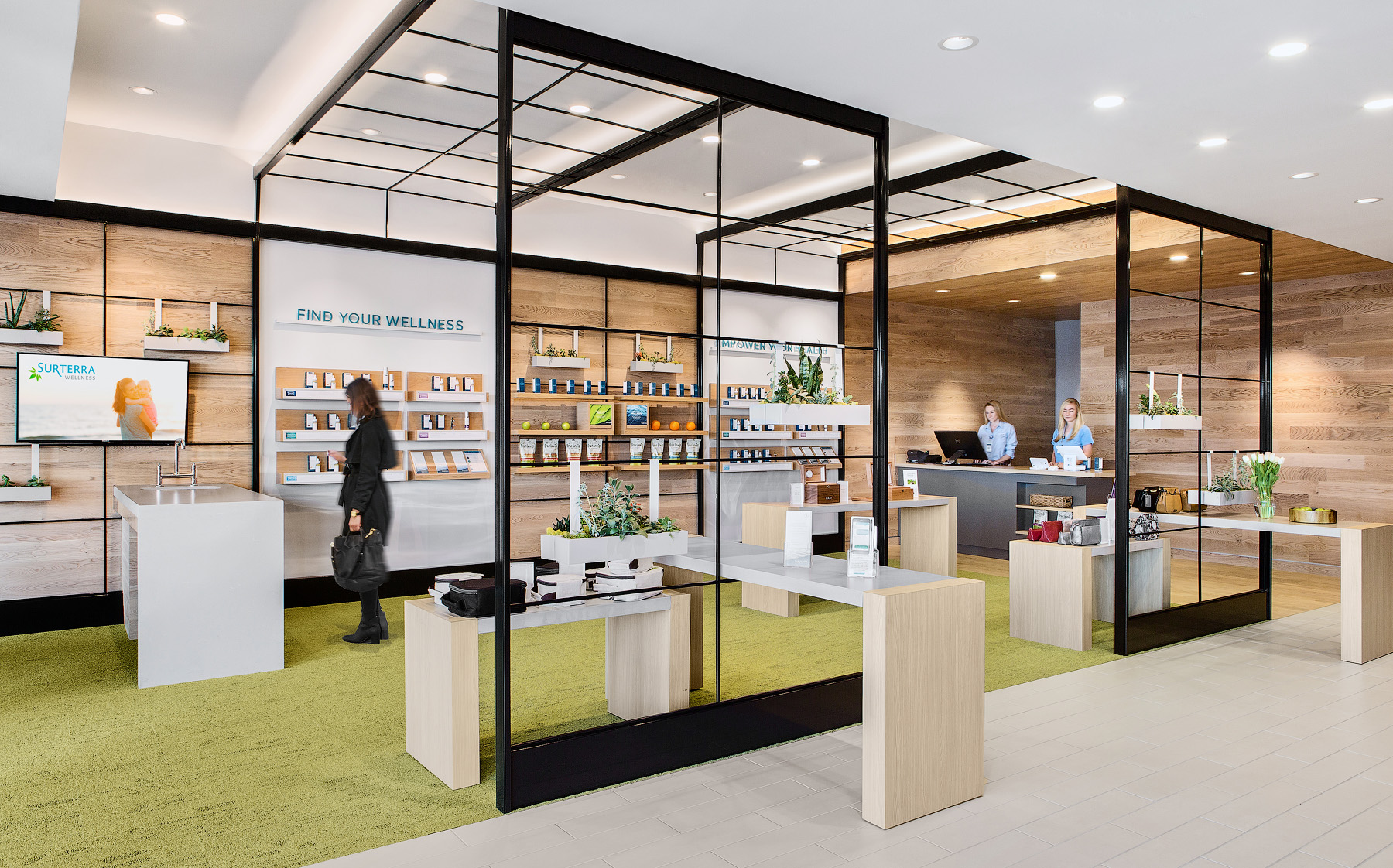
Above, Surterra Wellness’ dispensary design concept art
Who are the people that need to change their minds about cannabis for the market to flourish? Part of the enthusiasm for design is economic, as retailers eye the market that MedMen co-founder Adam Bierman dubbed “the Chardonnay mom,” shorthand for well-off consumers who, at the moment, spend little-to-nothing on cannabis. Retailers are tripping over one another in pursuit of this demographic; the flood of media stories heralding that the weed mom could be the new wine mom are evidence enough that the industry is heavily invested in seeing this market capitalized upon.
Megan Stone is the founder of High Road Design, a dispensary-focused design firm that won the 2017 Visual Merchandising and Store Display at the International Visual Competition Awards for their design of Level Up, a dispensary in Scottsdale, Arizona. She said the appeal of being the Apple Store of cannabis is strong. “I would say 80 percent of people who contact us say something about wanting to look like an Apple Store. I joke with clients who tell me that. I say — show me their twelve-million-dollar retail budget.”
Stone doesn’t buy the hype around the Apple Store look for dispensaries. “That’s a complete buzzword,” she explained. “There’s just more creativity to be explored.”
Much of the quasi-scientific approach to retail design in the cannabis industry is about making retail decisions that are supremely palatable to affluent customers, to quell their fears of participating in the green economy.
In designing Surterra Wellness, Najafi said the company’s team held extensive focus-grouping sessions and gathered all sorts of evidence about what clicked with their target consumers. They saw their design mission in terms of creating a community around the product.
“We study who the targets are, what makes them tick, what makes them comfortable, what makes them come back over and over into this space,” said Najafi. “That’s the goal of retail sales. What makes you come into a store is if you belong to that brand experience and you connect with that.”
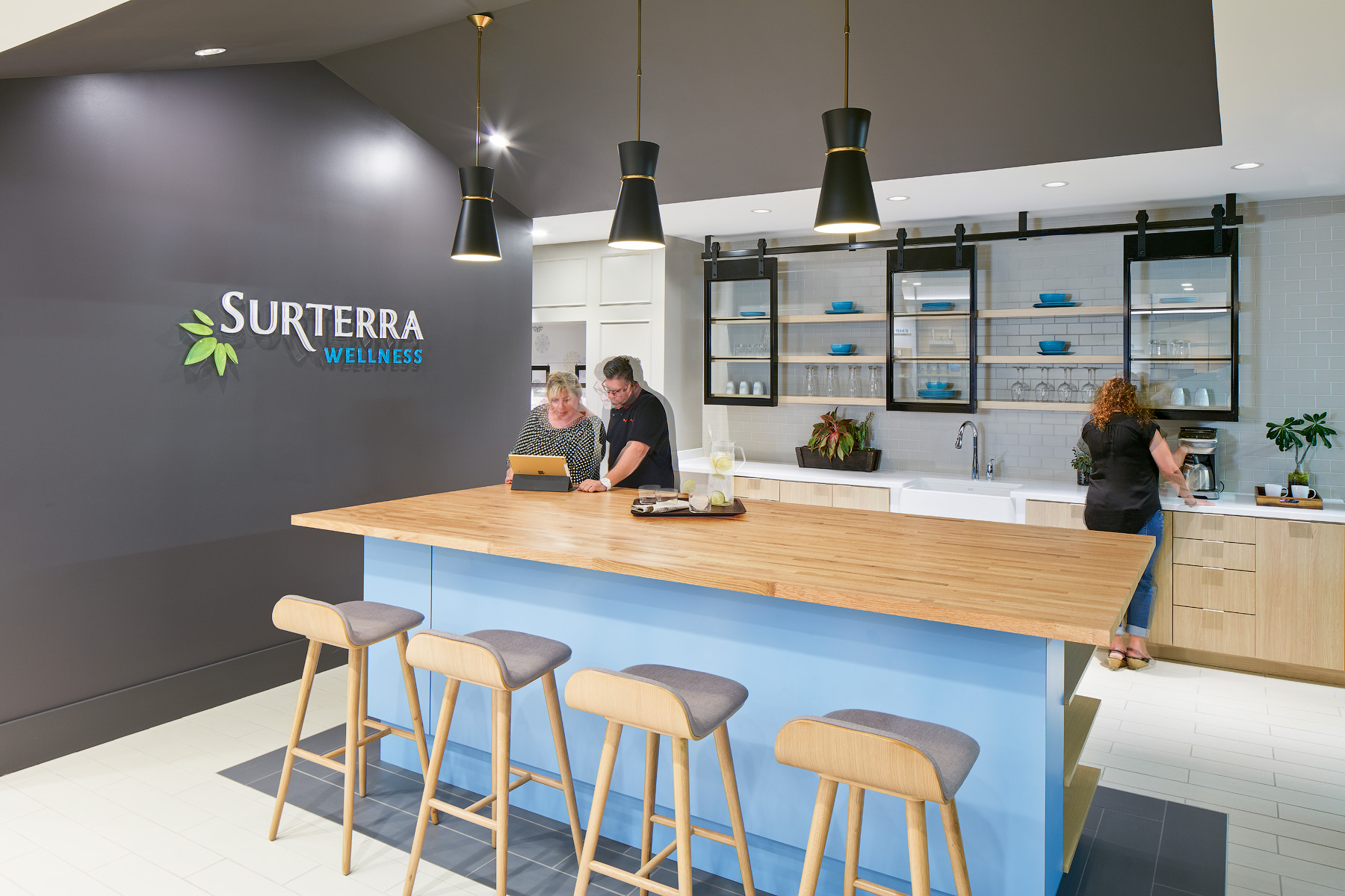
Above, Surterra Wellness’ dispensary design concept art
What remains unproven, though, is whether that demographic — the brand conscious, people concerned with wellness as a lifestyle, and the wealthy — will ever come to fruition, or if it even exists at all. According to one study released last year, even in legal markets, this demographic — sometimes called ‘modern lifestylers’ — constitutes around 10 percent of the cannabis market, and yet they are constantly being heralded as the “ideal vision of the future.”
Dispensaries have to balance the desire to bring in new customers with the necessity of serving traditional users when they’re starting a dispensary. Particularly, Stone is keenly aware that design can’t paper-over poor product. At even the nicest dispensary, customers “may walk out of that thinking it’s no longer gross and seedy and nasty,” she said, but if the product doesn’t measure up, “they might also not be excited to buy another joint again.”
The strength of this theory — that high design can win over new consumers — has been questioned by the recent financial woes of MedMen. Reports peg the company’s worth at $1.6 billion, down from $3 billion last year. It was also reported that the corporation lost $131 million in the back half of 2018. Poor results are being interpreted by some as a knock not only against the company, but also the very mission they set out for themselves.
“MedMen has spent buku bucks [sic] trying to convince America that people who smoke marijuana are not the same long-haired, tie-dye-shirt-wearing, hippie class it has been for the past several decades,” wrote Mike Adams in an article for The Fresh Toast. “MedMen is still struggling to attract enough customers to cover its bottom line. All of those ‘new’ cannabis consumers with the high-paying jobs and $50 haircuts that the company has been working so hard to charm seems to be more wishful thinking than reality.”
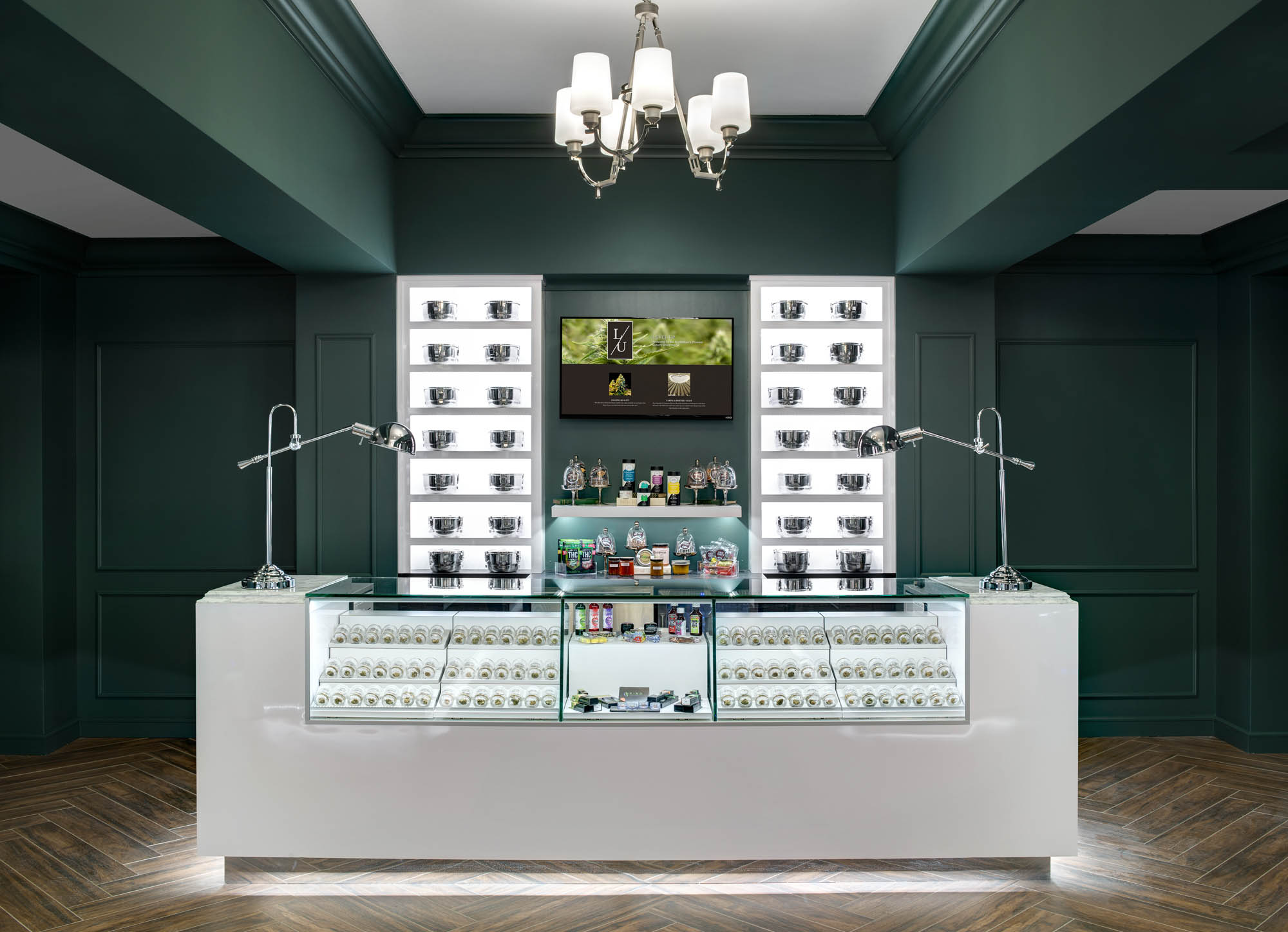
Above, Level Up’s dispensary design concept art
There are shops that are trying to break with the design trends. Superette is one of them. Another is Lowell Farms, which is on its way to opening one of the first consumption lounges in West Hollywood this year. Their founder, Sean Black, told MERRY JANE that in doing so, they attempted to find, and create, a space that was unique and cut against the current trends in cannabis design.
“We went out of our way to lease a space that was already like what we wanted, so that there was a minimal impact on the world to bring what we want to fruition,” he explained. They approach the decor like a large-scale repurposing project.
“There’s a lot of reclaimed and reused materials,” Black said, nodding to the fact Lowell Farms looked for restaurants across the country that were closing and selling off all their furniture. “We kind of looked at what kind of other stuff was out there, that would otherwise sit in a landfill or would be a waste. Anything we can recycle or upcycle, we do.” The result, based on renderings at least, is a cafe modeled as a sort of jungle-y, upscale restaurant.
It’s a model that was born out of Lowell Farms’ placing design at the center of business development. The company has its own in-house designers, rather than working with outside design firms, and Black said the company’s designers are therefore able to spend more time working on Lowell-specific ideas. The designers are consciously trying to do something a bit different, he added.
“I see a lot of people with a lot of respect and admiration for the Apple Store, trying to present cannabis in a clean, modern, light-filled space. I think that’s a really positive experience,” he said. “The Apple Stores are the number one retailers in the world, if you look at how much money they make per square foot. It’s a good model.”
But it’s not Lowell Farms’ model, Black continued. “We’re not about maximizing efficiencies or creating the most amount of money per square foot.”
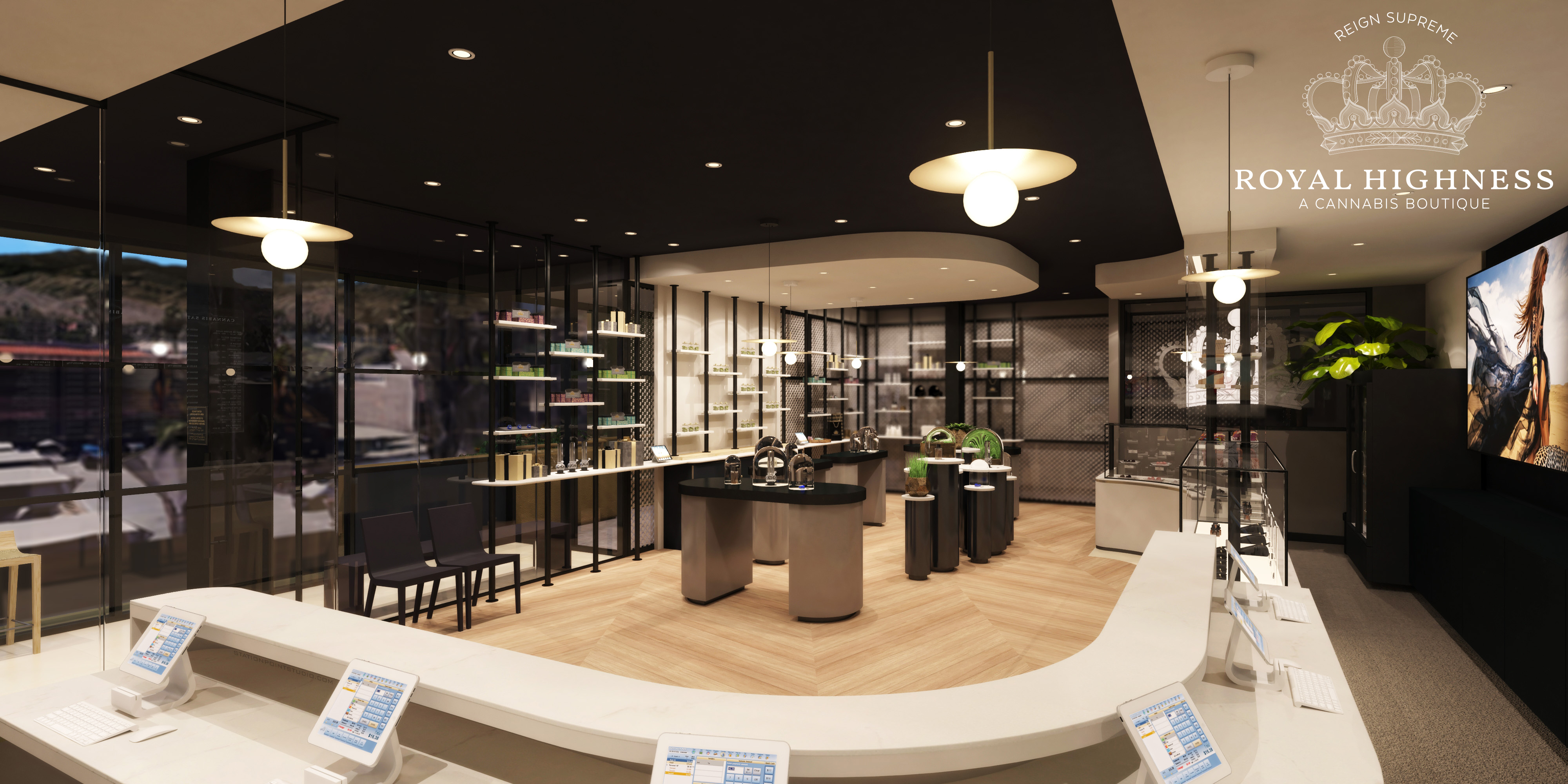
Above, Royal Highness’ dispensary design concept art, created by the High Road
Different or not, Black actually buys into the idea that the cannabis industry can win over the Chardonnay moms. “It’s important to have that really high-end stuff,” he said. A high-end look and feel gets the right people on their side — the kind of people who “donate to political campaigns.”
“Our number one goal is the widespread acceptance of cannabis use,” he said. And, to him, so what if that comes across as bougie or yuppie-friendly?
“If you look on Instagram, and you see people posting [their product], and they’re saying, ‘Ooh, look at my fancy weed! Look at my bougie weed!’ — We’ll take it, whatever! We want it to feel fancy to you.”
Follow Kieran Delamont on Twitter


